
Tiny rooms can be fun to decorate because they give you license to do something special and maybe more dramatic than you would in a larger room. Their smaller square footage means that there is less paint, paper or accessories needed to make an impact. Our tiny half bath is tucked in a back corner by the staircase. It shares a wall with a hall closet so it has a narrow entry with a cut out in the wall where the closet sits. When we first moved in it was painted a light blue gray color. The older cabinets below the sink had recently been painted a dark gray which I liked, because the cabinet fronts are flat and lack any architectural details.
I don’t have any really good before pictures of this room. The room’s petite size and shape make it difficult to photograph, but I do have a photo of the paint color. It was a ok color but there was nothing really special about the bathroom. It just a blank canvas begging for some paint and accessories. The trickiest part about the room is the green slate floors. We have green slate floors in the front entry way of our home and down the hall to this bathroom and the entry from the garage door. The slate is good because it stands up well to the snow and ice on boots. So I like having stone there, but I certainly would not have chosen green slate as my first choice. The slate was not something we were going to change so I needed to work with it.
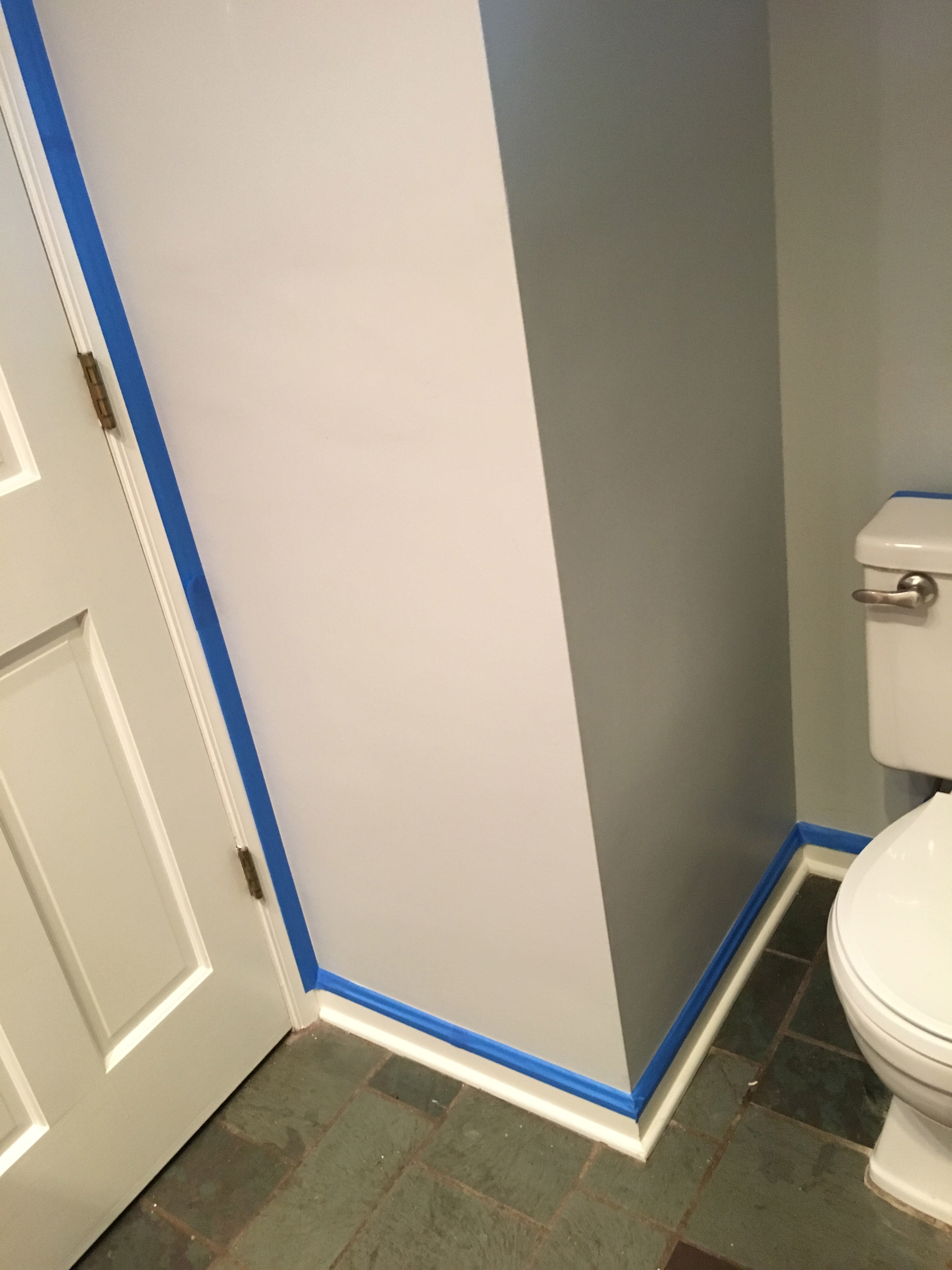
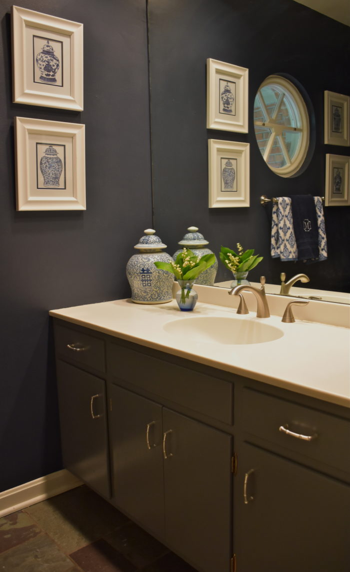
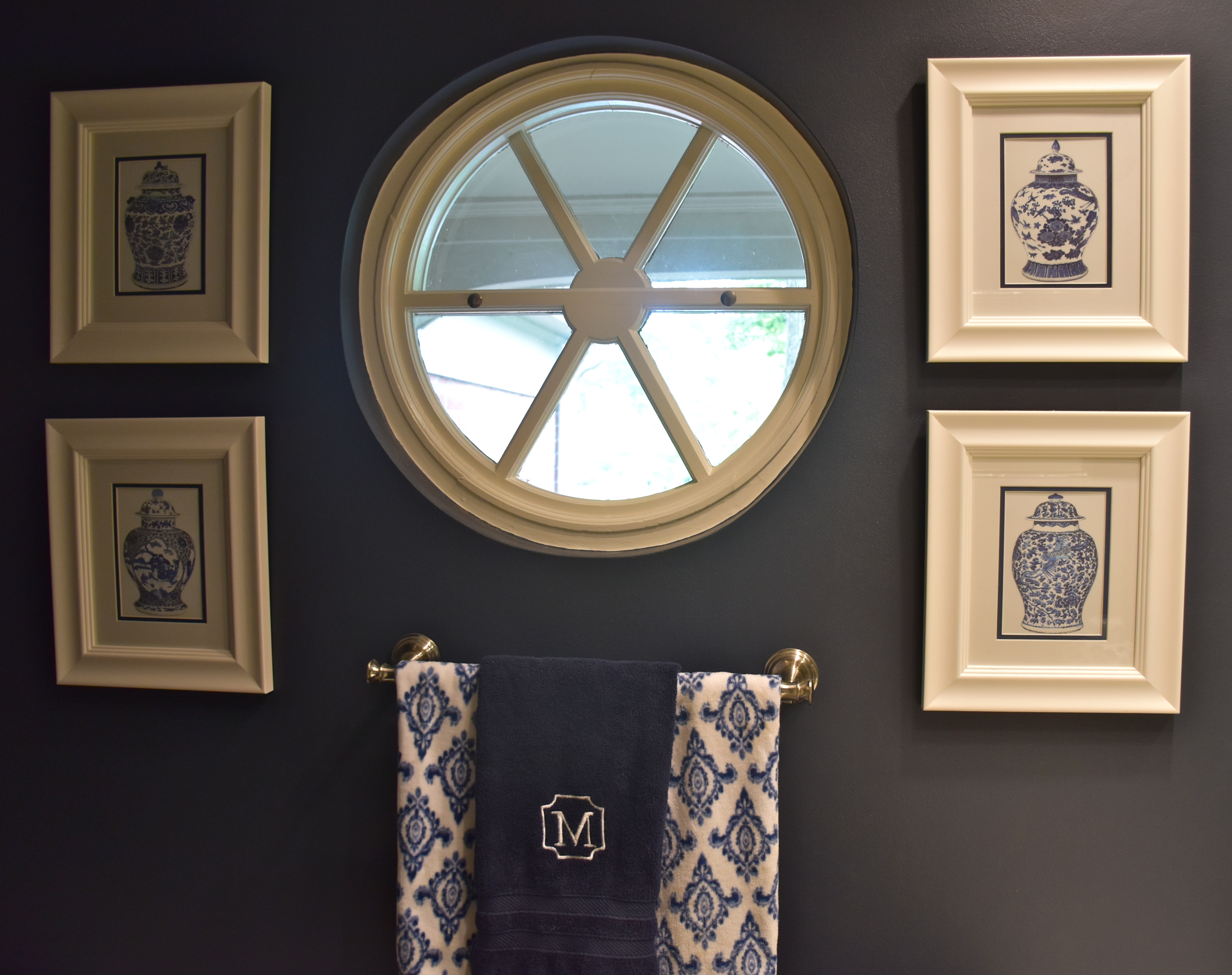
I knew I wanted to do something a bit more dramatic with the walls, but finding the right color was a little tricky. The floors are fairly busy since there a lots of shades in the slate from an emerald green to a deep aubergine purple. At first I tried out a deep blue green from Sherwin Williams called Tempe Star. I liked the color but it just didn’t work with the floor. There was too much green in it. So I decided that I need to steer away from green and find a shade to complement the floors. I tried a few other colors to see what direction I wanted to take. In the end the Hale Navy Paint from Benjamin Moore on the left was the winner. It was dark, so it make the cut out in the wall fade away and it flatters the floor instead of competing with it.

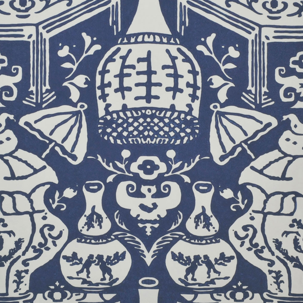
Once I found the right paint color I began to focus on the details of the room. After thinking about the dark blue color, I knew I wanted a look inspired by the classic Chinoiserie wallpaper by Clarence House called The Vase. I would have loved to use this paper, but with young children and a limited budget wallpaper was not an option. Instead, I decided to take inspiration from the vases and incorporate the look with accessories.
I decided to add some blue and white prints to break up the deep inky blue. I found a wonderful shop on Etsy called Paperwords 11. They had these great ginger jar print sets. They are printed on watercolor paper so the details and colors are lovely up close. I found the white frames and the white and blue matting at Hobby Lobby. The focal point of the room is the round window so I decided that I would treat the window like you might a round mirror so I hung the prints as a set on either side.
My favorite way to hang print sets like this is to use painters’ tape. You can see below that I placed two large strip of tape across the window at the height I wanted each pair. Then I took a yard stick and a level and drew a straight line across to ensure the pictures were level without marking up the wall.
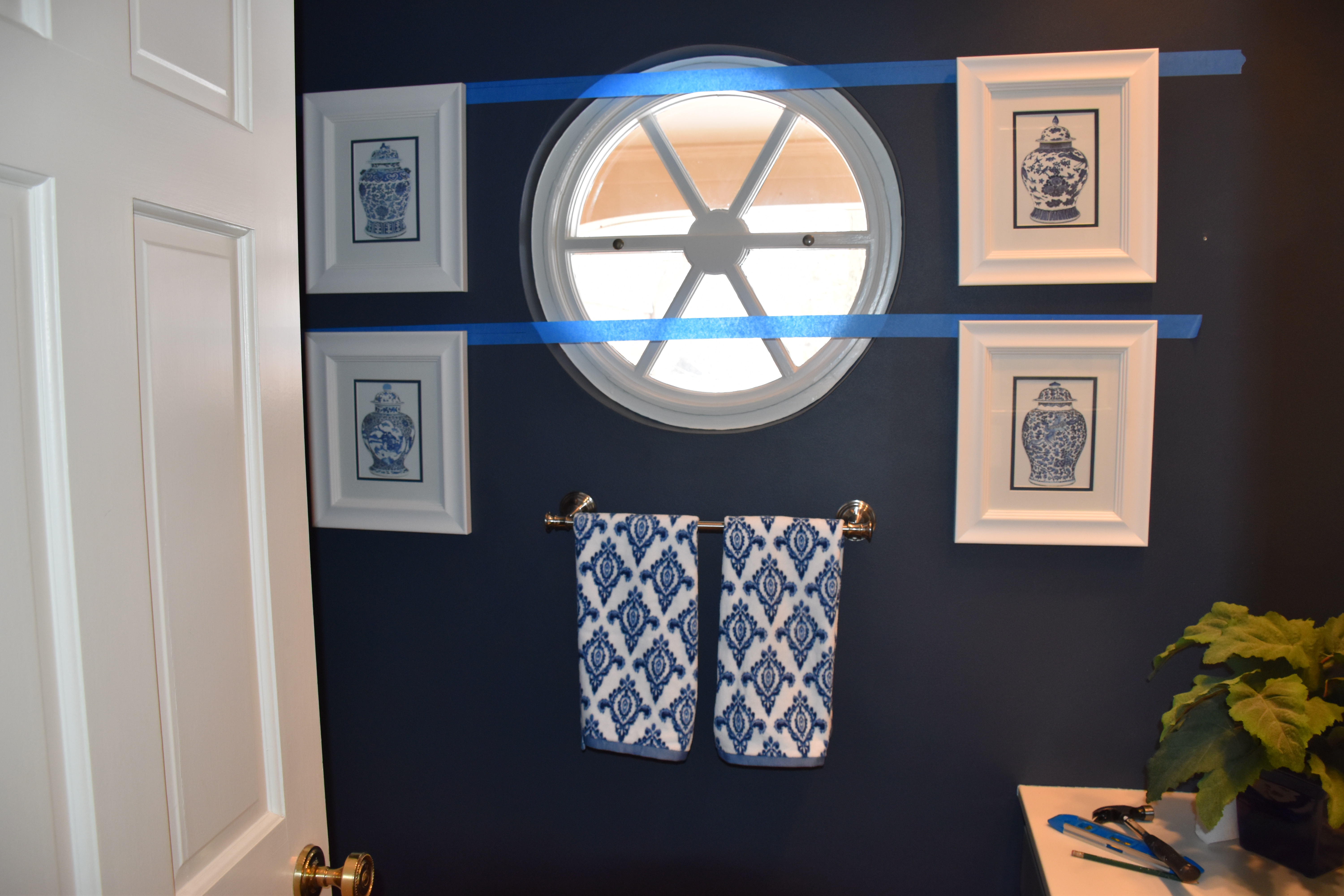
When we moved in there wasn’t a towel rack. I found this Delta brushed nickel towel rod at Home Depot. I hung the rack under the window because I wanted to make a statement with the hand towels. Since the one small window didn’t need a drape, I wanted to incorporate the look of a pattered fabric with the hand towels. I found these towels designed by Dena Home. I liked them because the pattern reminded me of the painted details on a chinoiserie pottery. I decided to layer a third solid navy towel with a monogram on top from Pottery Barn to give the set a polished look.
I had two museum prints of from the MET in NewYork. My husband loved the Japanese woodblock prints so we purchased them on our honeymoon years ago. I framed them in some bamboo frames I spray painted with a sliver metallic finish.
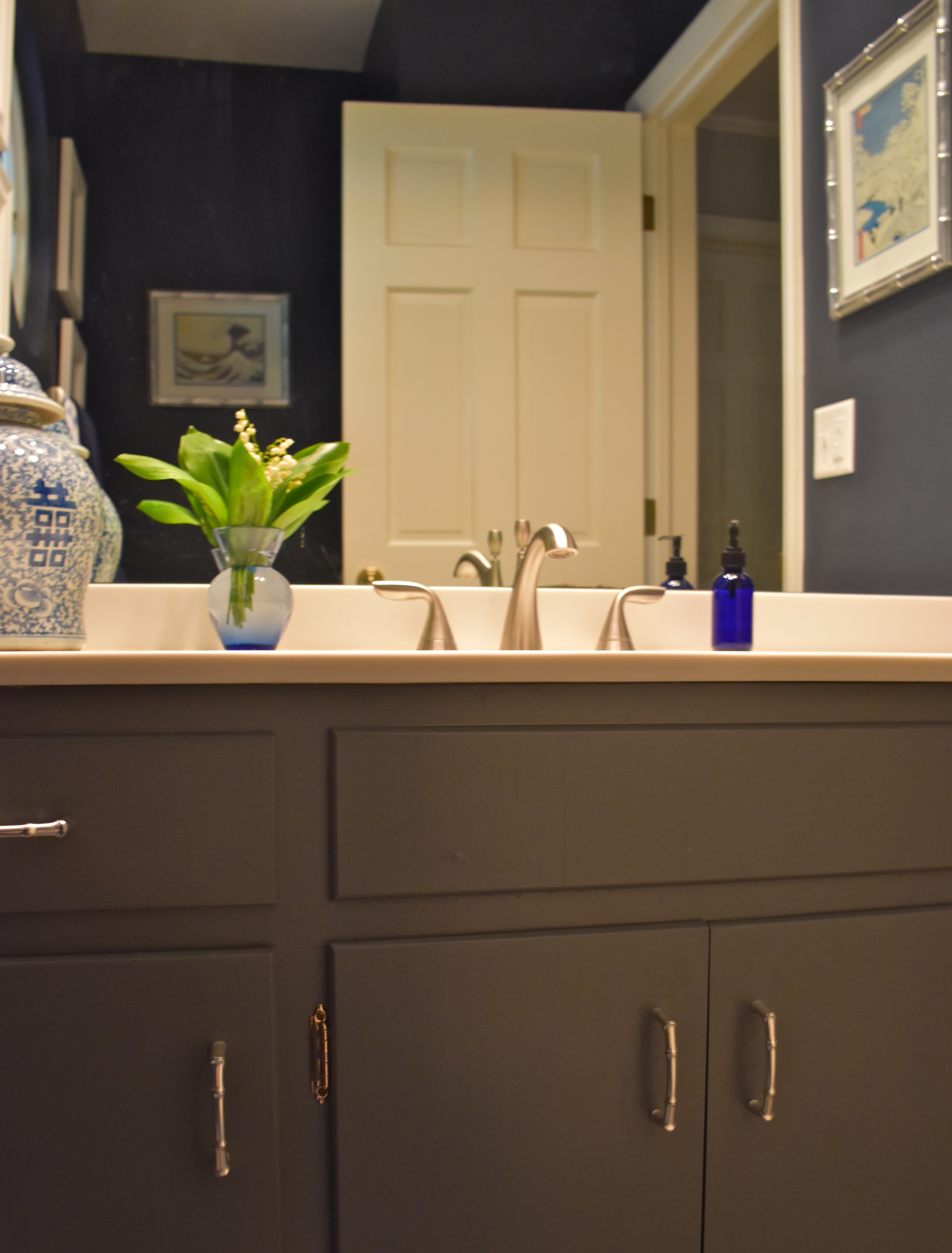
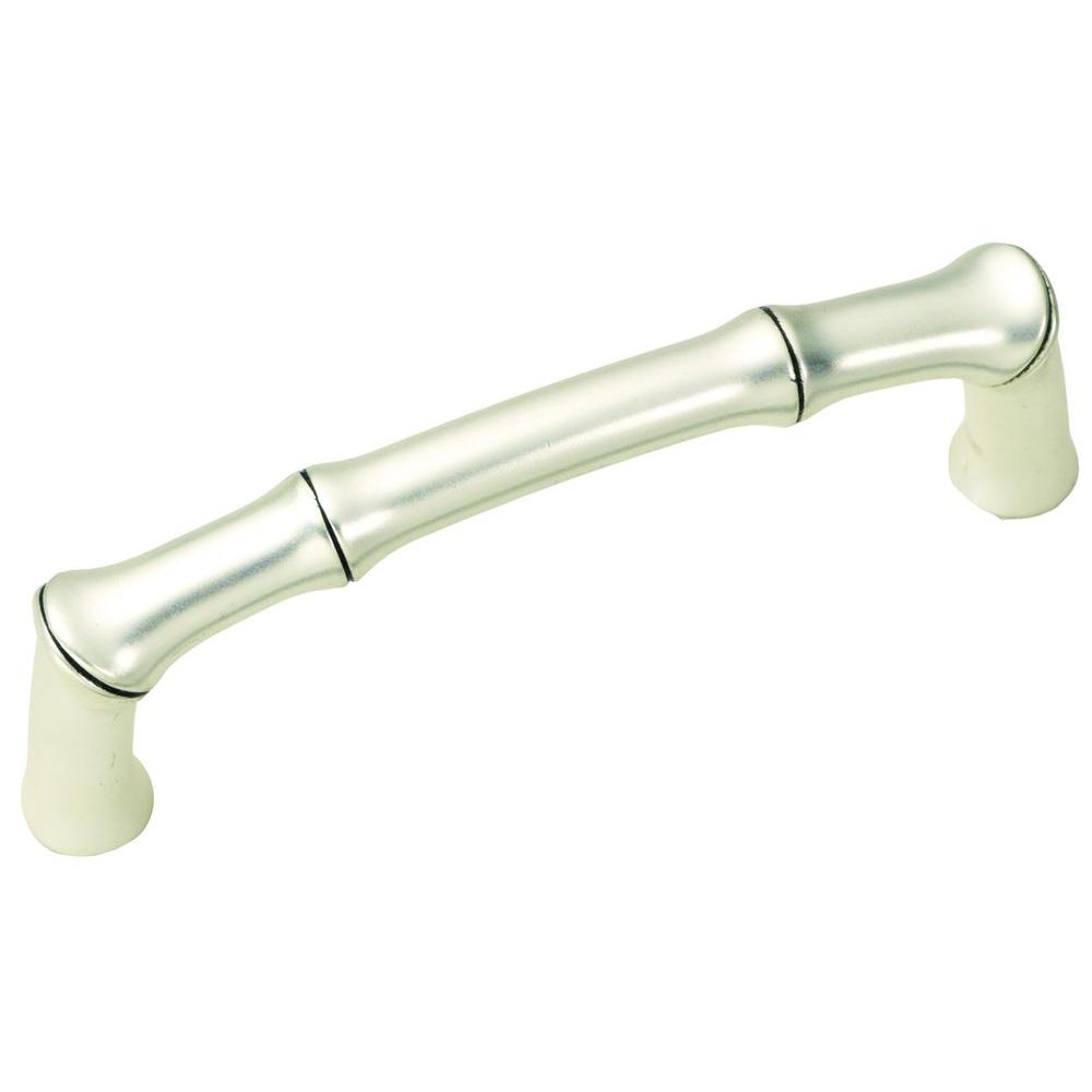
Finally for a finishing touch I changed out the hardware on the cabinets. I found some pulls by Hickory Hardware which look like bamboo, so they fit the chinoiserie style. The pulls were not expensive, but they added a decorative finish to the cabinets. I liked the antique silver finish and they were easy to install.

This little half-bath is our only bathroom on the first floor so I wanted it to have a polished look for guests. I needed it to be able to stand up to everyday use with use without it feeling too boring or ordinary. In the end, I am glad I went with the dramatic inky blue walls. They set the tone for the room and they make the green slate tiles standout as a feature instead of something I was trying to camouflage or ignore. All the blue and white details and Chinoiserie paintings keep this small room from feeling to dark and they give it the stylish and glamorous feel that I wanted.
So classy! It turned out beautifully! And I’m relieved to know that I’m not the only one who obsesses over the perfect paint color. 😉
Thanks. This was definitely one of those painting projects where I had to step back and really think about it.